Microsoft is visually refreshing its productivity suite with newly designed icons for nine core Microsoft 365 apps. The new look is aimed at softening the geometry, strengthening color, and creating a more consistent visual language that harmonizes with Copilot, an AI assistant. The updated icons will start emerging for folks on Windows, the web, iOS, and Android as app and service updates roll out.
Why Microsoft Is Updating the Microsoft 365 App Icons
The revamp, Microsoft’s design mavens say, is meant to make the suite more approachable and coherent across platforms. Familiar sharp corners and harsh angles are replaced with soft folds and bends, which suggest activity and warmth without sacrificing any of the legibility at small sizes. The color system is similarly bolder and more saturated, a response to the visual vibrancy that the company brought in with Copilot.
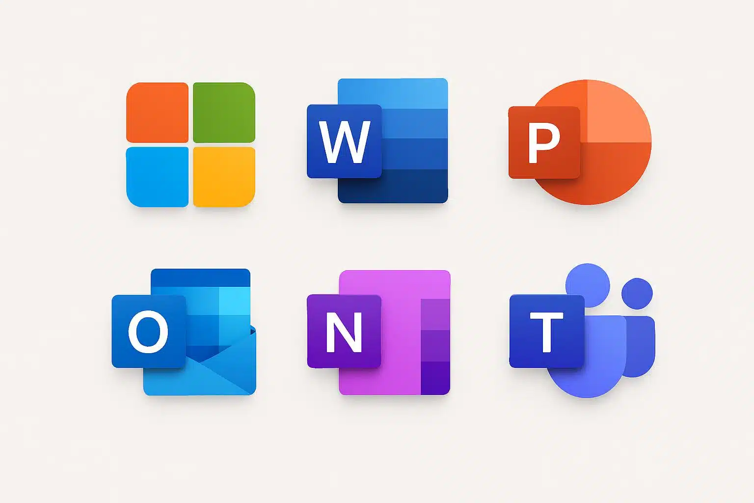
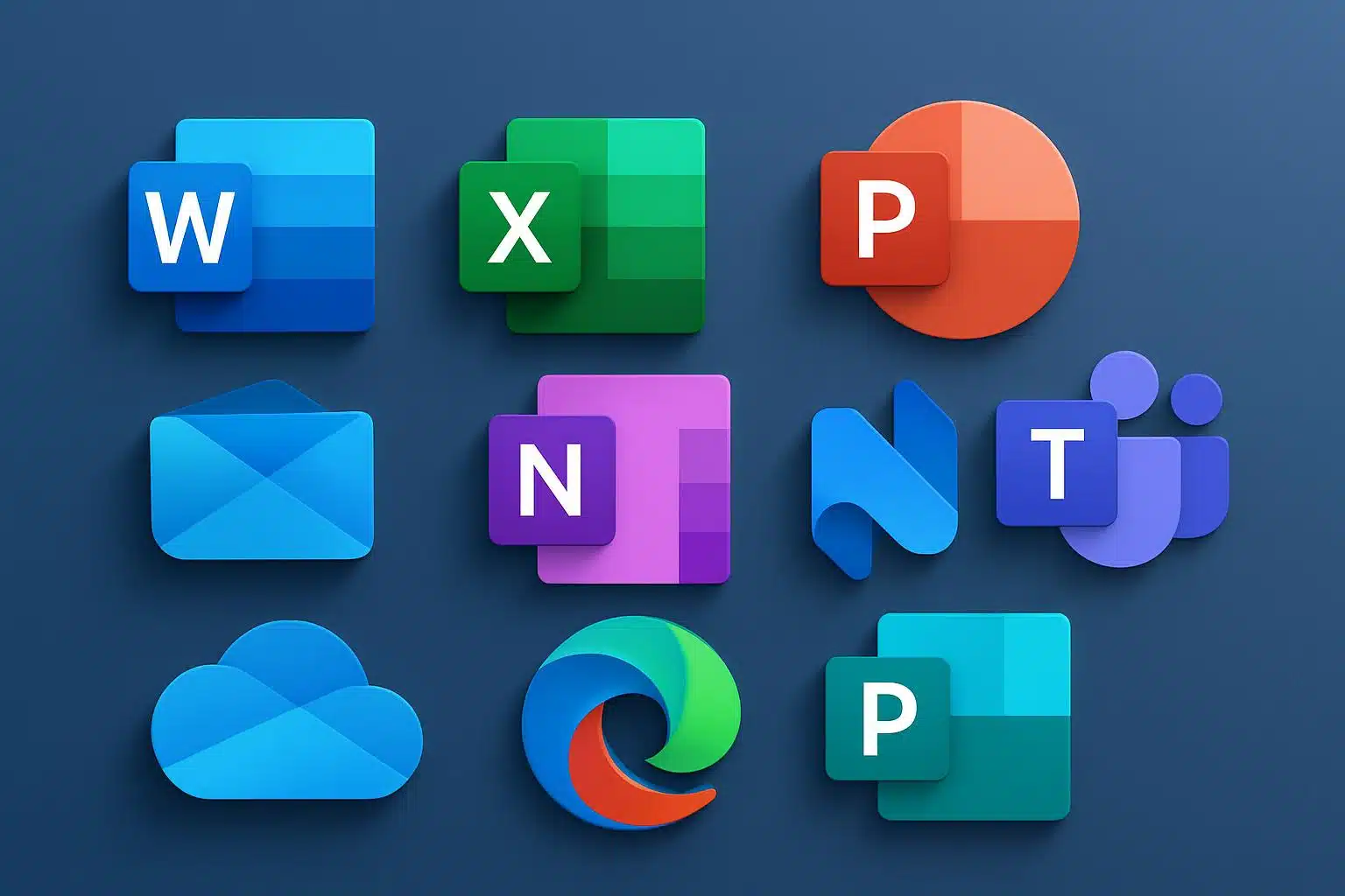
Most significantly, the team decided to keep front and center the popular letterforms on the apps people use most on a daily basis—Word, Excel, PowerPoint, OneNote, and Outlook—regardless of which way they were placed, with research indicating a very high amount of brand equity without actually having any words present. The outcome is a contemporary pack that honours the traditional models we’ve all grown to know and love, yet brings a fresh twist to the surrounding shapes, gradients, and background space.
What’s Changing in the Microsoft 365 App Suite
The refresh includes Defender, Excel, OneDrive, OneNote, Outlook, PowerPoint, SharePoint, Teams, and Word. You’ll notice:
Gentler shapes and banded “fold” motifs that imply depth without the need for heavy skeuomorphism.
A fresh colour palette, featuring clearer primaries and more subtle gradients to enhance legibility in both light and dark themes.
Aligned grid and sizing for a closer feel between icons on the Start menu, taskbar, and mobile home screens.
Teams, SharePoint, and Defender look cleaner without losing sight of their contours (especially helpful in busy sidebars or notification trays). The document-centric apps keep their initials, for now, but they have been blended into a looser container that feels like a departure from the boxy feel of prior generations.
A Copilot-Inspired Design Language Across Microsoft 365
Internally, the company’s design teams have begun rallying around a future that involves unifying product visuals under an evolving Microsoft design system, and Copilot has been a north star for curvature, layering, and motion. The new crop of icons steals that language to develop a family resemblance across services that now have AI components. It’s a visual reminder that your files, chats, and dashboards are increasingly feeding through the same smart layer, no matter what device you’re on.
The change also acknowledges the way people open and switch apps today. Baked into Word, Outlook, and Teams, Copilot treats icons, care of app pointers, as stairways into AI-enhanced activity like summarization, drafting, and scheduling. Matching symbols make it easier to hop between those workflows by reducing friction.
Rollout Details and Where You Will Find the New Icons
According to Microsoft, the iconography will begin updating automatically on Windows PCs once app updates start rolling out, with alterations appearing in both the Start menu and taskbar as well as in file associations. Web apps in the app launcher and favicons will update, and icons for iOS and Android will update with their next app store release. Enterprise customers should find the new baseline rolling out through managed update channels without further effort.
If your company has custom documentation, shortcuts, and training materials with outdated imagery, now’s a good time to update them. And because the new icons are designed to retain recognizability, end users should not need much in the way of retraining, but keeping visuals in sync reduces confusion.
What It Means for Microsoft 365 Users and Admins
For end users, the practical advantages are subtle but tangible: faster recognition in cluttered interfaces, enhanced contrast at smaller sizes, and a more consistent experience across devices. IT admins will appreciate the standardization that this brings to endpoint theming, documentation, and accessibility reviews (including color contrast against dark mode and high-contrast backgrounds).
The redesign also shows how Microsoft 365 is sold more as a single ecosystem, not a bundle of standalone apps. That’s also in line with the company’s earnings commentary (again from yesterday), which makes clear that it “continued to benefit from strong adoption of consumer subscriptions as well as broad usage across commercial deployments spanning productivity, security and compliance, and cloud app and server products.”
How It Fits in the Productivity and Design Industry
Big productivity suites, to some degree, refresh the icon inventory to reflect changes in product strategy. Google, for instance, consolidated its Workspace icons to express a more cohesive suite identity, while Adobe simplified Creative Cloud badges for better legibility and brand consistency. Microsoft has split the difference between familiar and forward-looking design by retaining those iconic letters but adopting a softer, AI-era aesthetic.
The Bottom Line on Microsoft 365’s Redesigned App Icons
These redesigned Microsoft 365 icons are more than a paint job—they are a visual handshake of legacy app features and the new AI-empowered backbone running through them. The new look will slowly start appearing on your devices. When it does, it should register as both instantly known and softly new, which is the whole idea.